Yo & Co
5k to 9,457
Followers
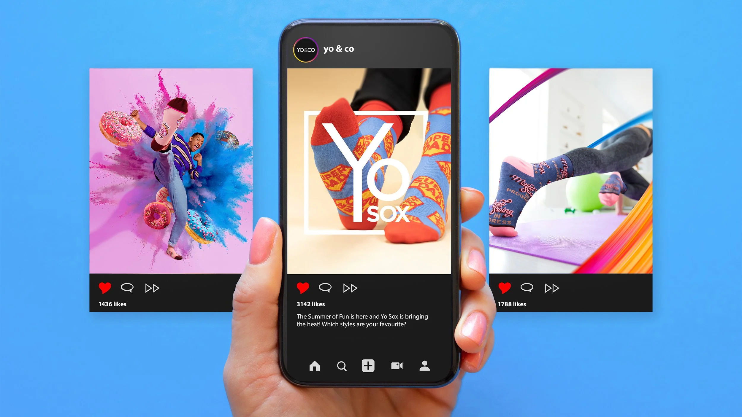
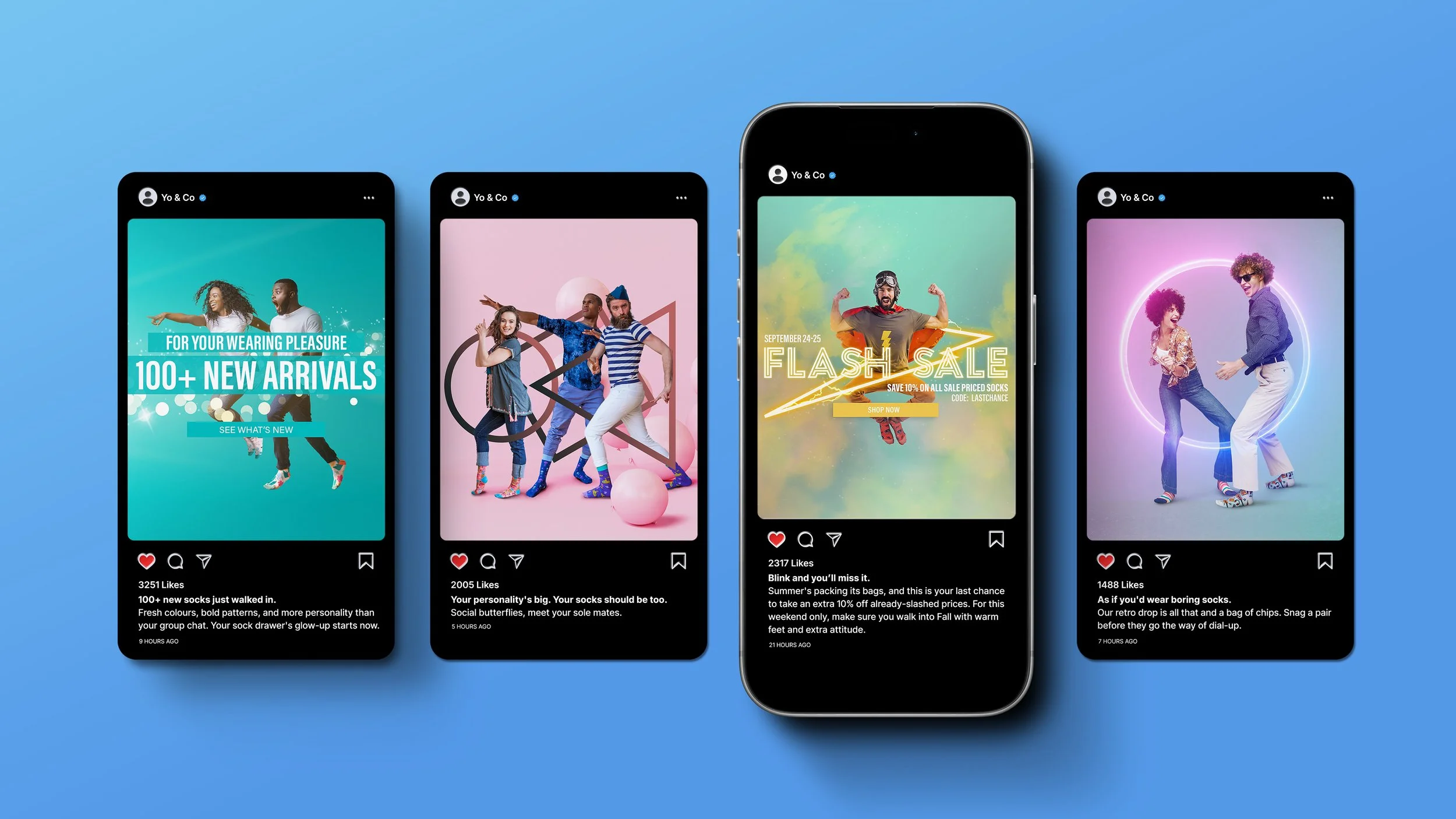
I rebuilt the social presence around a bolder visual identity and a content system designed to be seen, not scrolled past. Vibrant color, modern layouts, and a voice that finally matched the brand's energy, showing up consistently enough that people had a reason to stick around. Growing the account from 5,000 followers to 9,457 in four months.
+14%
Site Conversion Per Visitor
I carried the same direction through to the site, so the experience people found after clicking matched the one that brought them there. No gear shift between the ad and the shop, just one continuous brand doing what it promised. Conversions per visitor rose 14%.
35% to 52%
Email Open Rate
Redesigning the email program from the template up, and bringing the new identity to the inbox with layouts built to be recognized at a glance. Every send looked unmistakably like Yo & Co, which made opening it feel like hearing from someone familiar rather than getting another promo. Open rates from 35% to 52%.
Evolving Your Identity As Your Audience Changes.
Client
Yo & Co (formerly Yo Sox)
Brand and Growth Strategy, Social Media Management, Art Direction, Web Design, Email Design, Digital Editing.
Roles
Timeline
1 Year
Tasked with converting a B2B brand into a DTC brand brought interesting challenges. Wholesale buyers care about margins and reliability; shoppers care about how a brand makes them feel in the first two seconds. Most brands make that leap with an identity built for the old audience, which is why they end up looking careful in a space that rewards personality. I started with what the brand actually sounds like, then built the visual direction around it, color, type, layout, and motion that gave it momentum. From there it became a system rather than a one-off: social, web, and email working from the same foundation, with templates and rules that keep it consistent long after launch. The result is a brand that reads the same everywhere, holds its own in front of consumers, and still gives retail partners something they're confident selling.
Overview
A name change is only half of a rebrand. The look had to catch up to the personality, and it had to do it everywhere at once. The original brand, Yo Sox, had different tone and treatments across every channel: social, web, and email. Which meant the brand read differently depending on where you met it. Recognition suffered from a brand that felt like three, and creating an updated, cohesive direction across every channel was at the core of this project.
The Challenge
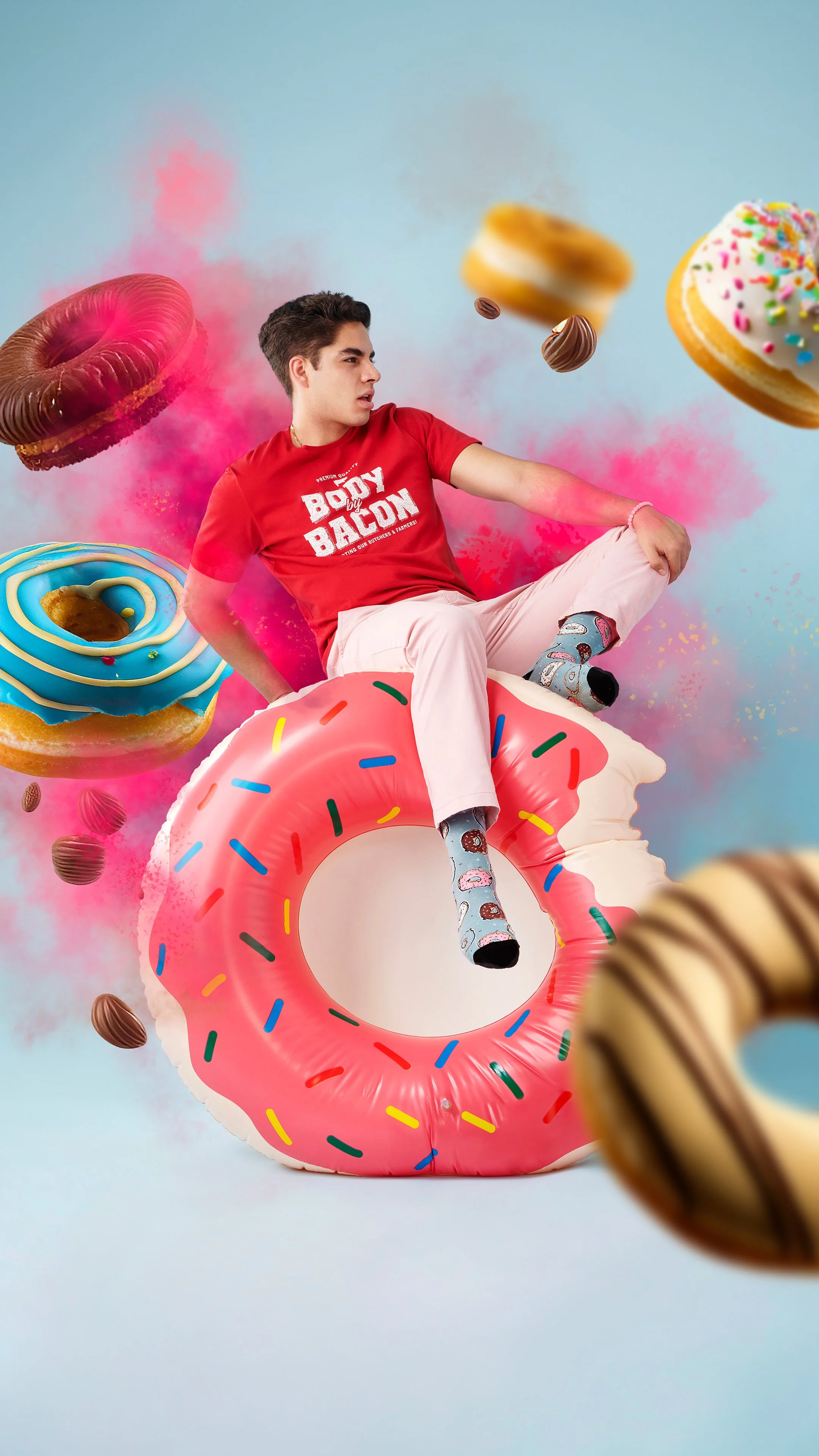
I led with personality. The visual identity was rebuilt around vibrant color, modern layouts, and energetic design elements that matched how the brand actually sounds. The goal was a look with momentum, playful enough to feel like Yo & Co and bold enough to stop a scroll.
But a look is only half the fix. The real problem was that social, web, and email had each been developing their own visual logic, so the brand never accumulated recognition. So I built a single direction all three could work from: shared color and type rules, layout patterns that translate across formats, and reusable templates that make the right choice the easy one. The point wasn't uniformity. Each channel still does its own job. Email drives action, web sells, social builds affinity. But someone moving between them should never have to reconcile what they're looking at.
Every piece was produced end to end, from art direction and photography to videography and design, keeping the look and message consistent across every touchpoint.
The Approach
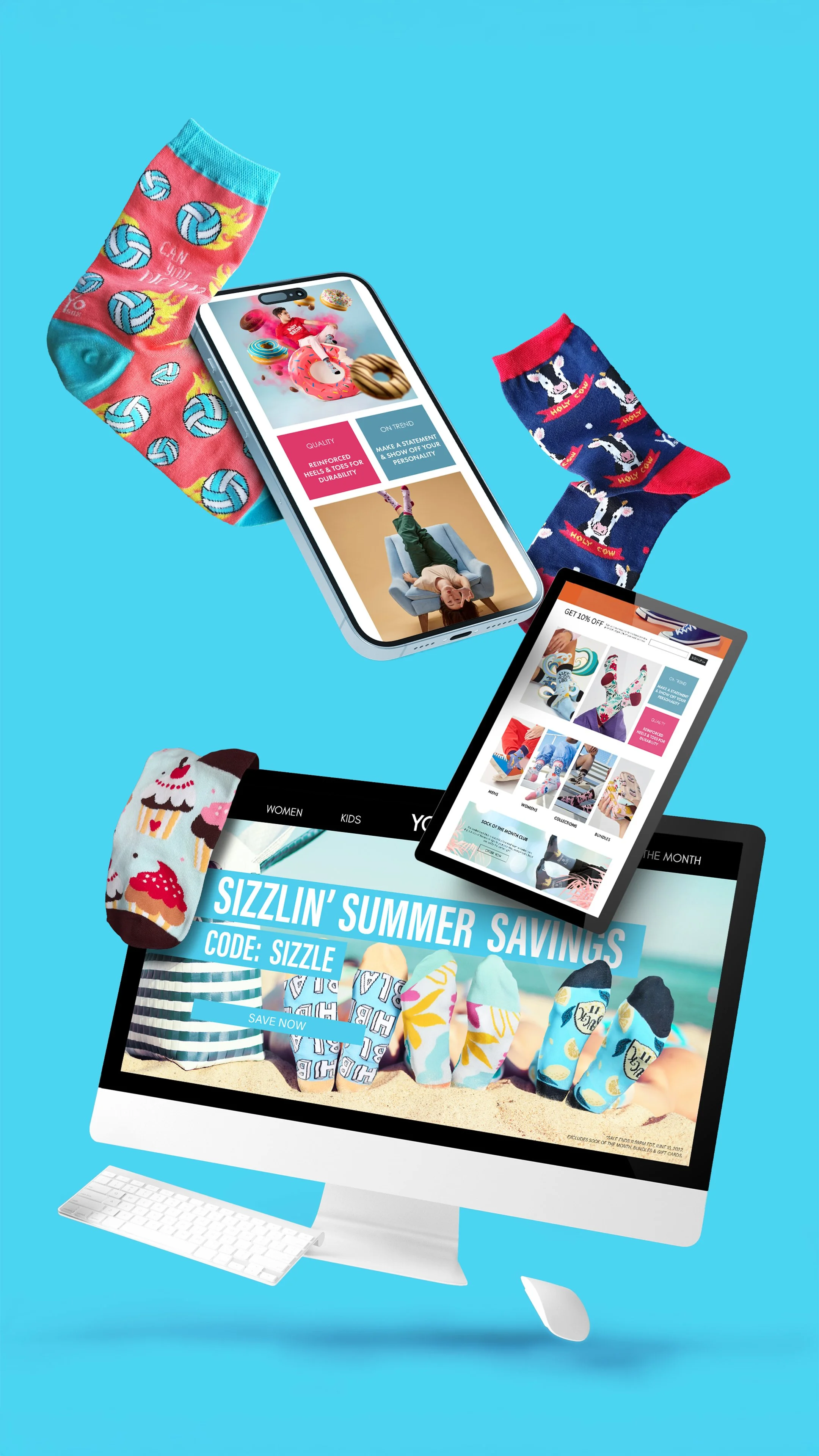
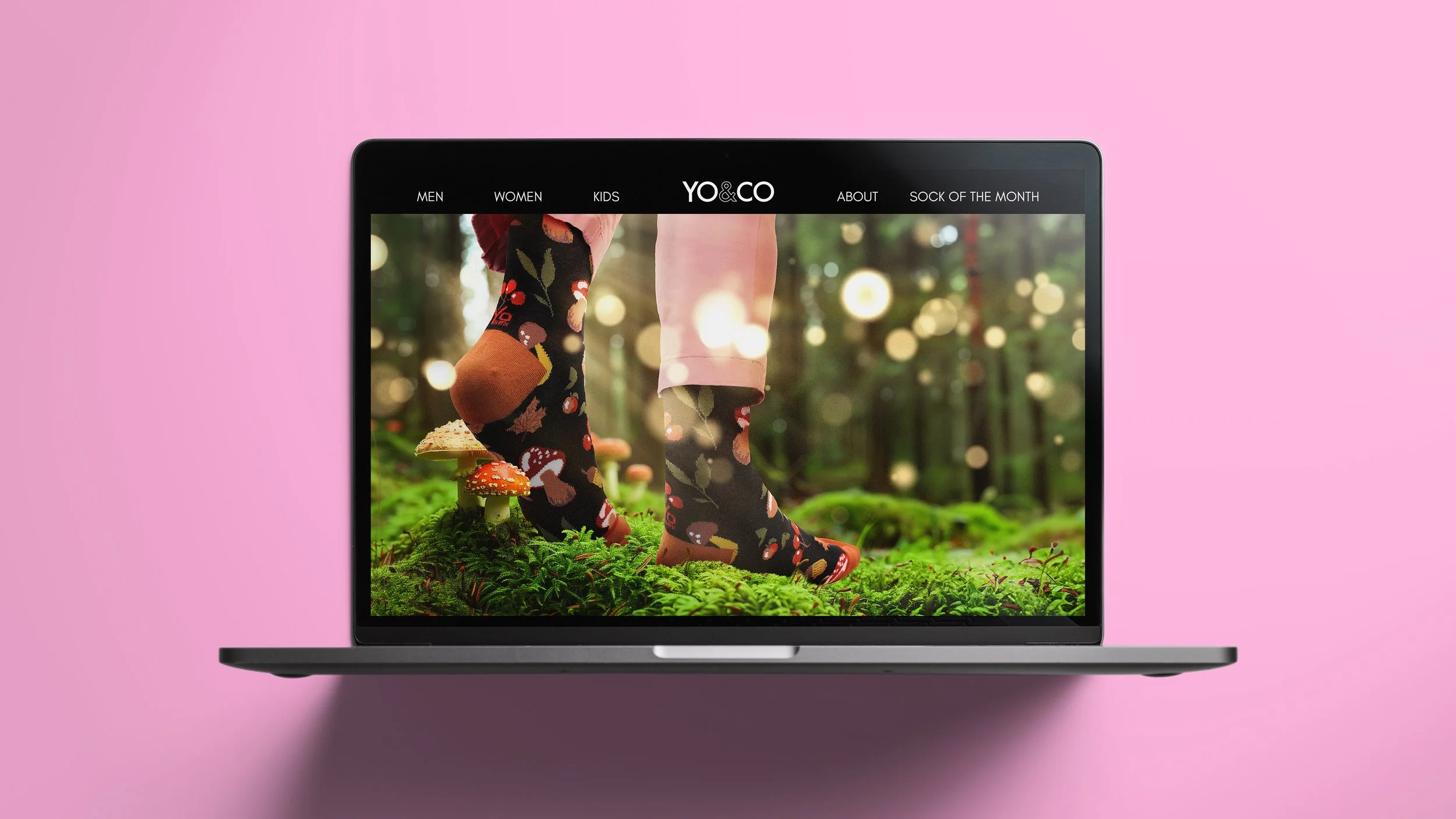
The refresh rolled out across every digital touchpoint. Social content set the tone and tested what landed. Web design carried that energy into the shopping experience. Email design kept it consistent in the inbox, where most brands go quiet and beige. Every channel now pulled in the same direction. With a rollout that featured a more engaging, exuberant identity built to capture attention, strengthen recognition, and connect with audiences wherever they meet the brand. Yo & Co now spoke with one voice, and one look, no matter where someone found it.
The Results
Brand & Visual Direction
Led the visual evolution from Yo Sox to Yo & Co, building an identity around vibrant color, modern layouts, and energetic design elements that matched the brand's personality.
Established color, type, and layout rules that translate across formats, giving every channel a single direction to work from.
Built reusable templates and design patterns that made consistency the default rather than an ongoing effort.
Social Media Strategy & Growth
Rebuilt the social presence around the refreshed identity, developing a content system designed to stop a scroll and hold attention week after week.
Shaped a brand voice that matched the visual energy, giving the feed a personality consumers could recognize and follow.
Grew the audience from 2,000 to 6,200 followers in five months as the brand expanded from B2B into direct-to-consumer.
Web & Email Design
Redesigned the email program from the template up, bringing the new identity to the inbox with layouts built to be recognized at a glance.
Applied the visual direction across the website so the shopping experience matched the impression that brought people there.
Aligned web and email with social to eliminate the gear shift between discovery and purchase.
Creating Impactful Work Within Real Constraints.
We don't always have the right tools, or the time we need to do our best work. Every project comes with something missing: the budget's smaller than the brief, the timeline moves, a shoot falls through, approvals narrow what you can say. So when unexpected situations like the COVID shutdown occur, you need someone who can adapt. That moment took studio production off the table entirely. No crew, no models, no conventional way to shoot a product people wear.
So I built the piece from what already existed. Working with user-generated content, I edited footage shot in a garage with a phone into something that felt intentional rather than assembled, pairing a health-conscious message with the brand's humor so it read as genuine instead of opportunistic. Good editing is what makes that possible. Pacing, sequencing, and sound turn raw material into a story, and UGC brings something a studio shoot can't buy, which is real people actually wearing the product. The constraint pushed the work somewhere more distinctive than a conventional shoot would have, and it shipped when it needed to.

View More Work
Charlie Paige
Swatch Group

Bodyography